The Six Senses Palette is a collaboration with Emmeli Eek Christensen of @oak.and.paper. Each watercolor has walnut stain added, softening the pigments and adding earthy undertones, tonal variation and a beautifully unpredictable quality as the colors dry. The result is a muted, weathered and wonderfully imperfect palette with a character entirely its own.
In Emmeli’s words:
There’s a little giggle escaping me when I unbox the pan where I can see grains and particles in the paint. A little uneven and almost like you scooped up a handful of something in nature and plopped it in a pan, asking it to behave like paint. It does, mostly.
Just as Mette describes them, they are all quite earthy and grounded tones, happily content being absolutely unique without trying to convince anyone – until you pay attention. The more you look and work with them, the more fun it becomes. They are a bit about the color, a lot about the effect. And. The. Effect. Mm, I tell you, granulating colors could be the only ones I use one day.
This set contains six colors – some a bit muddier, some brighter with a bigger contrast between the light and dark washes. They all feel like they came out of a silent, slow storm in the North and they will take to the paper in the same way. Stormy, but slowly.
#420 – Pebbles & gravel
SOUND
Grey with a blush.
Living in the parts of this country where the ground consists of more rock than soil, I’d say I know my grey stones and pebbles. They make up my heritage and most of us are still living here in spite of them, rather than because of them. All those foggy, unyielding slabs forged a notoriously stubborn, curious and creative line of people and you know what? This deceptively ordinary shade will do exactly the same with the artist.
Painting with Sound is the equivalent of letting molten rocks pour from your brush. It’s thick and a little muddy, waters out gently to a soft shade with pinkish undertones. Not a pink grey. Just hints of blush in the edges. Magic when it dries into a calm surface that looks just like a rough pebble picked from the forest trail.
#421 Misty skies
SIGHT
Moody blue.
It’s a bit funny, this one being called Sight when it reminds me so much of the foggy skies over the Sound between Sweden and Denmark that prevents sight in particular. Where I can sit and look from one shore to another on a sunny day, but most of the days the ocean dissolves into this thick mist that goes on and on, and I have to remind myself there’s a complete country on the other side.
Sight is a medium blue with a lot of grey in dark washes. But washes down to a beautiful, airy light blue. And in between – the granulation, like little thunderclouds that feathers out spectacularly.
#422 - Earthly blooms
TOUCH
Muddy lilac brown.
To this day, I cannot actually place this shade onto the color wheel. It eludes me, because when I think it’s a grey it turns brown. And then there is a soft, comfortable lilac, so warm it’s almost rose. Or perhaps there’s a hint of reddish earth?
Touch is smooth and velvety, a little muddy and misty and very gentle in it’s granulation. And actually, who needs to put a name on something that takes you for a slow, relaxing little journey?
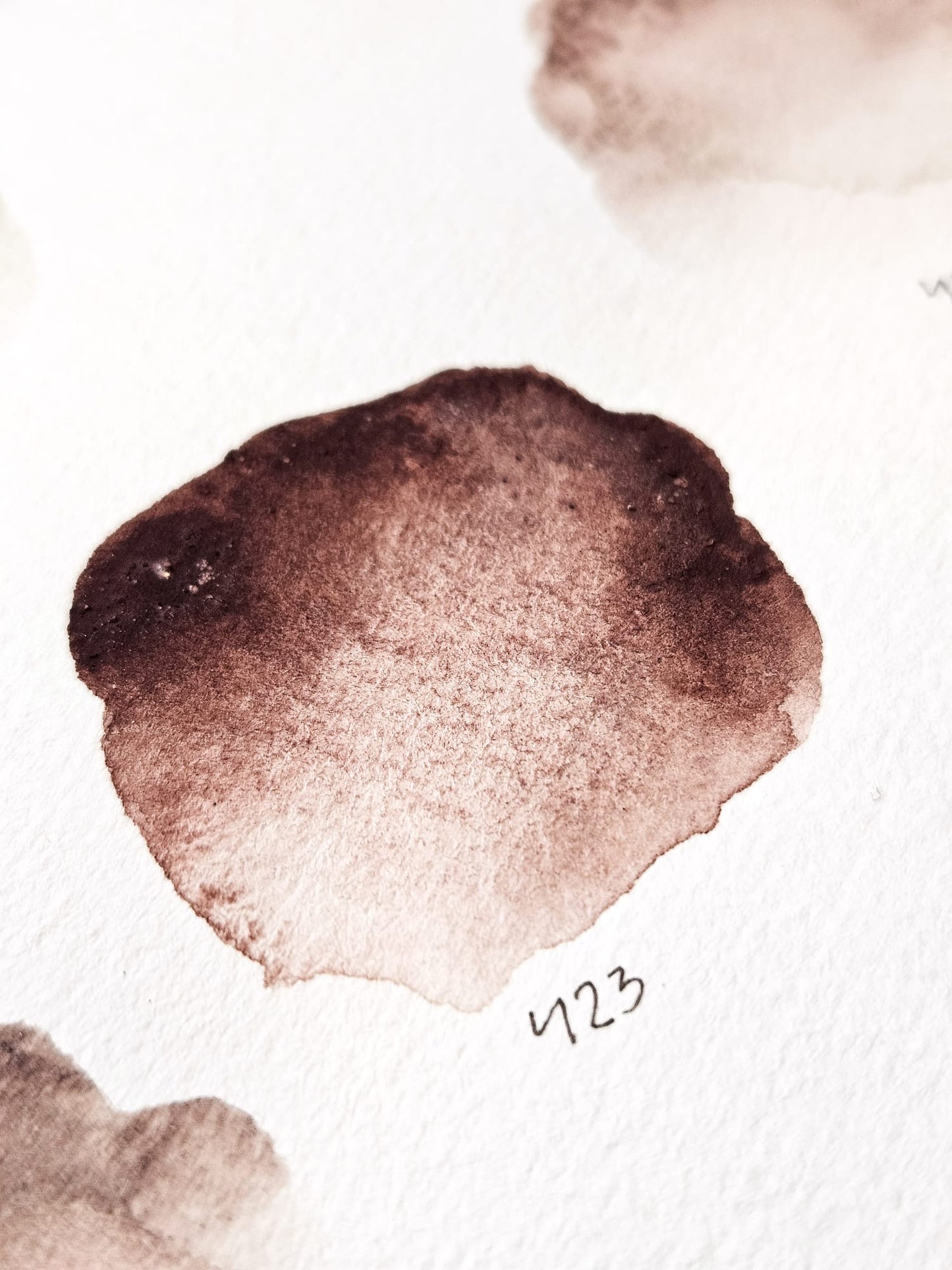
#423 Dark romance
TASTE
Dried, red roses.
Is there a dreamier shade? Each little swatch I make with this shade is like a single, dried petal from a red rose. From a very light, translucent rose pink to a darkened dramatic brownish red in just a stroke, depending on the water. It’s a laid-back, wizened shade that feels like memories in a box, something dear and timeless.
Taste has a lovely granulation that brings out all the nuances of the paper and the color.
#424 Hidden gem
SMELL
Greenish brown.
Here is a muddy brown if I ever saw one. Riverbank mud, perhaps. It’s got grey and green undertones and goes from very light to heavily pigmented. Have you ever sat by a shore, letting the muddy sand fall in globs from your fingers, reveling in it’s soft and gooey texture? If not, I feel a bit sorry for you, it’s delightful. Anyways, you can still experience this with Sound! And add something deep and dark like Perylene Green, and voila! Instantly you have a gorgeous, faded jewel tone.
#434 Sparkling stone
SIXTH SENSE
Pink stones.
This Potters Pink with walnut is the only pink I think I need. It is light and airy, with rich blooms that looks like stone that fizzles. It can be washed to almost-not-even-there light to a stony and greyish vintage pink and it has the most amazing granulation. The blooms are like tiny fissures and cracks in the glaze of an ancient vase, and the grains pop a little wherever they want. I imagine painting with Sixth Sense is the equivalent of painting with sparkling champagne – just as joyful and mischievous, yet timeless and delicate.