This palette was created especially for Camilla Damsbo Brix’s book Ink & Wash Wildflowers. Each color is handmade in small batches and chosen to match the mood of Camilla’s universe.
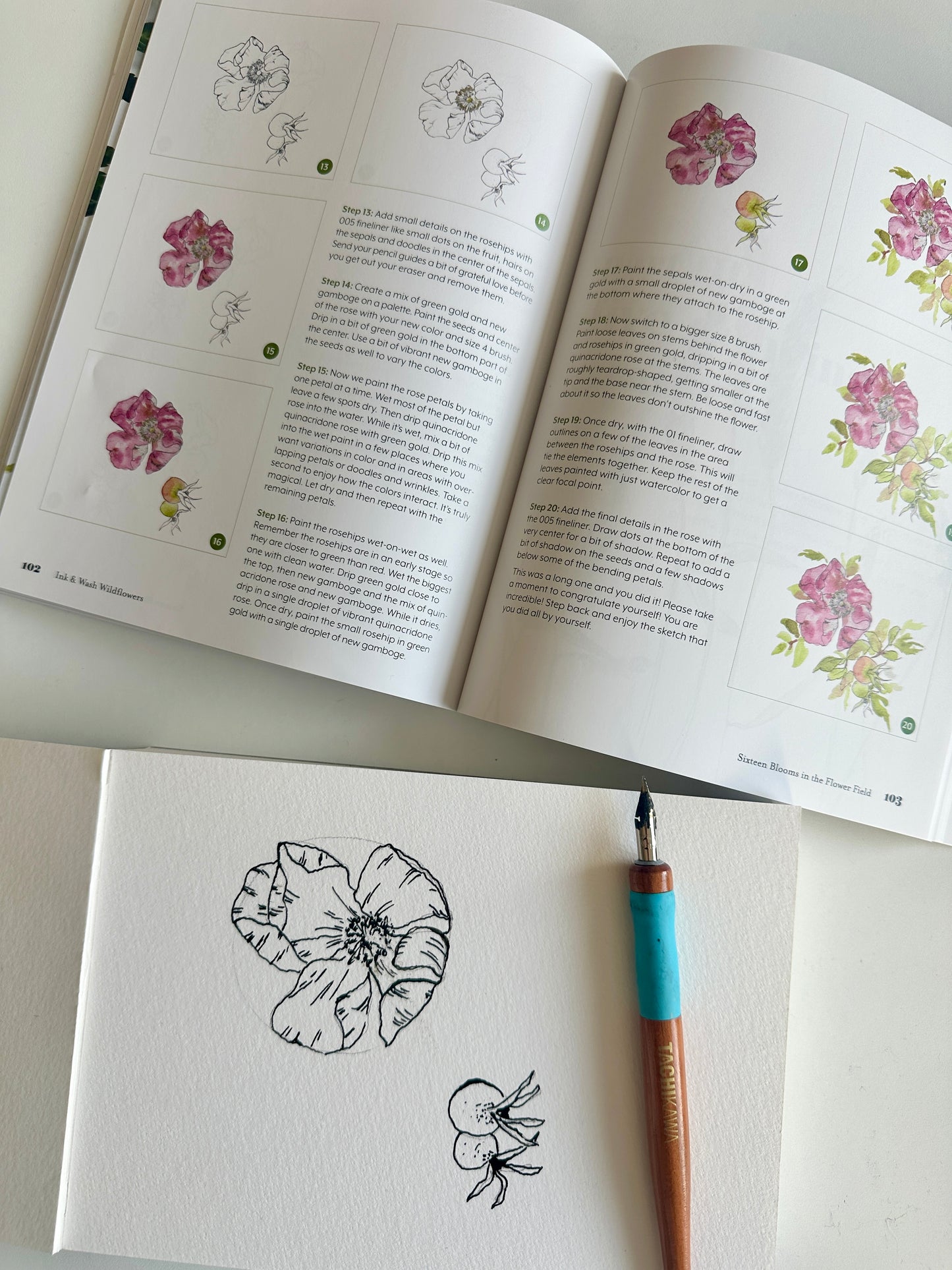
It’s made to support the way Camilla paints: ink first, then watercolor, then that quiet moment where the page starts to feel alive. The colors are calm and useful, with the kind of range that makes it easy to build depth without overthinking it. You get earthy neutrals that behave like real nature, greens that feel like stems and leaves, and pinks and violets that can sit softly in a petal without turning into candy.
This palette is not about painting perfectly. It’s about slowing down enough to actually notice what you’re doing. The sound of the brush. The way the water moves. The way your nervous system calms down when you focus on one small flower for ten minutes. It’s that kind of palette.
If you’re painting along with the book, you’ll recognize how naturally these shades fit into Camilla’s world. And if you’re not, but you just want a handmade watercolor palette that feels grounded, natural, and easy to live inside, this one is still for you.
The colors are:
#29 – Prussian Blue (cool blue)
#114UC – Payne’s Grey (gray with a blue tone)
#341 – Dioxazine Violet (cool violet)
#5 – Sap Green (warm, earthy green)
#340 – Green Gold (cool green)
#14 – Quinacridone Rose (cool red)
#261 – Hansa Yellow Light (cool yellow)
#117 – New Gamboge (warm yellow)
#343 – Burnt Umber (warm brown)
#342 – Van Dyke Brown (cool brown)
Enjoy painting.
With love from Camilla and Mette
You can find Camilla’s Ink & Wash Wildflowers book here:
https://camilladamsboart.com/book_wildflowers