The Greenland Palette - Limited Edition
The Greenland Palette - Limited Edition
Couldn't load pickup availability
The Greenland Palette was created as a quiet counterweight to noise. It is seven mineral based watercolors that lean into space, stillness, and the kind of presence that does not need to raise its voice.
Limited Edition
The colors are built around a sense of landscape rather than decoration. Wide light. Deep air. Stone, ice, distance, and the soft glow that happens when light meets mineral surfaces. Several of the shades contain mica for a subtle, shifting luminosity, and one includes graphite, adding a gentle, earthy depth. The effect is not sparkle or glitter. It is a low, mineral sheen that appears when the paper moves in the light.
On paper, these colors granulate, separate, and settle in ways that create natural texture. They feel grounded and atmospheric rather than flat, and they invite a slower pace while painting. Washes open up. Layers build softly. Edges breathe.
This palette works especially well for:
• wide landscapes and open skies
• stone, ice, and mineral textures
• muted, atmospheric compositions
• paintings where light and space matter more than contrast
The Greenland Palette is about creating room. Room on the page, room in the process, room in the moment you are in while painting. It is a set that encourages you to pause, look a little longer, and let the painting unfold without rushing it.
Seven colors. Mineral, textured, and quietly luminous.
These are the colors:
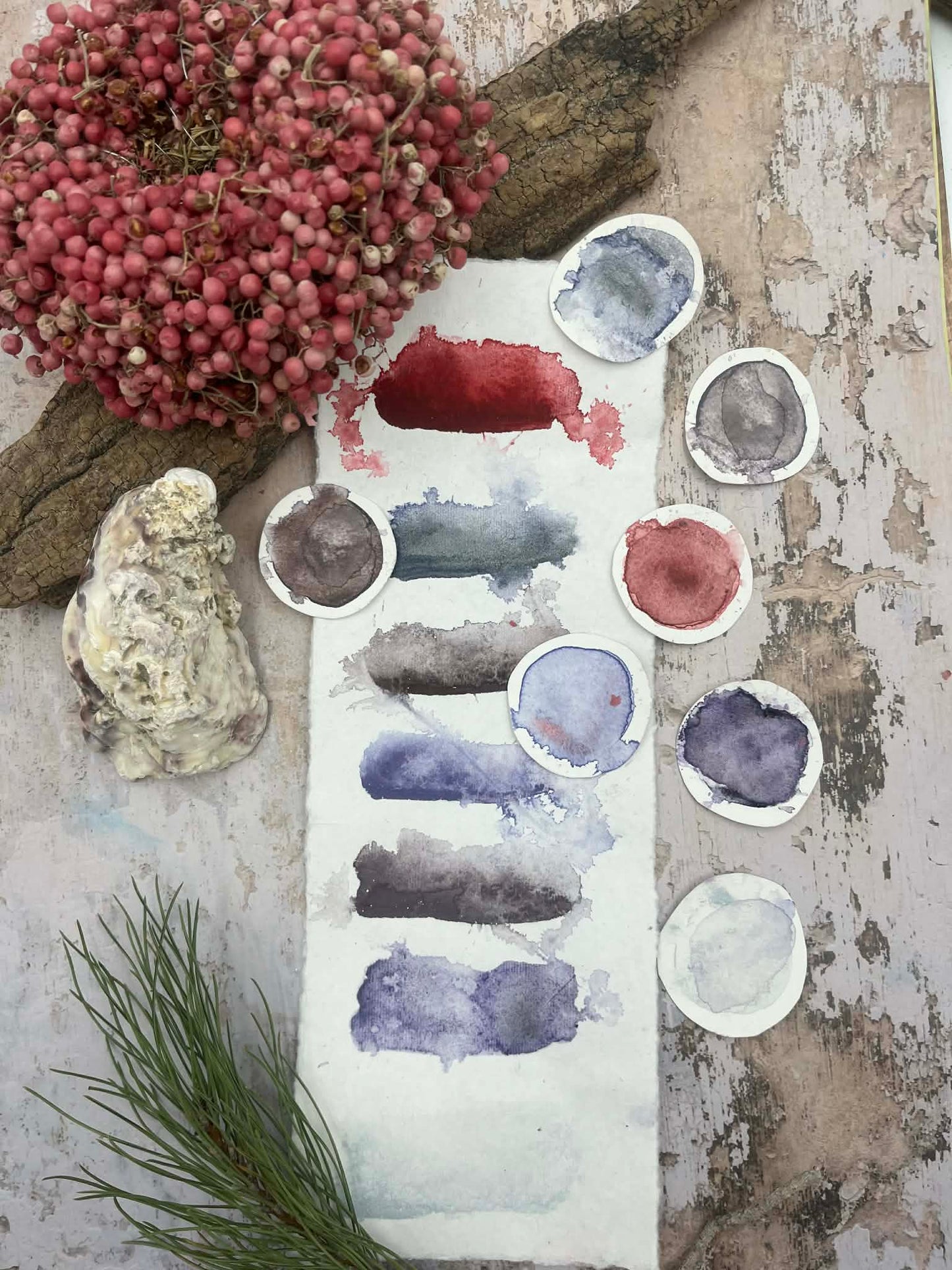
#438:
Deep, soft red with a grounded warmth in it. When it touches the paper, it lands with presence. There is red brown mica in it, and that gives the color a mineral depth, like warmth coming from stone and earth. It feels bodily. Like blood, like soil, like something that belongs to being human. Only later did I realize that the Greenlandic flag is red. I hadn’t planned that. The color just went first, like it already knew what this palette was about before I did.
#439:
Blue violet with heavy graphite. This color settles with weight. The graphite pulls the pigment down into the paper and gives it a dusty, stony depth. It feels like shadow on rock, like distance, like something shaped slowly under pressure. As it dries, it builds tiny landscapes on its own.
#440:
Caput mortum brown with green gold mica. Caput mortum already carries iron and earth in it, and the green gold mica adds a subtle shift, like moss and moisture resting on old ground. The color granulates and gathers in the texture of the paper, so the surface feels layered and alive, like looking down at soil that has a history you can’t fully see.
#441:
Light lilac with pink mica appeared. This one moves gently in water and opens across the paper. The pink mica gives it a soft mineral glow that brings warmth into the light areas. It feels like light living inside ice.
#442:
Softened dark burnt sienna with gold mica. This is the deep earth of the palette. Warm, dark, steady. When the paper catches the light, a golden mineral glow rises from the surface, like sunlight touching dark rock. It brings life and richness into the darker passages.
#443:
Violet with feldspar. Feldspar is one of the main minerals in Greenland’s ancient bedrock, and in this color it brings a raw, stony texture. The pigment settles and separates, sinking into the paper and creating its own structure. It feels like something that belongs deep in the earth.
#444:
A zinc white with blue mica. This is my “blue snow.” On the paper it carries a cool, airy light. When the surface moves in the light, the blue mica gives a gentle mineral glow, like snow holding the sky inside it.
Share