The Purple Palette of Time 2026
The Purple Palette of Time 2026
Couldn't load pickup availability
The Purple Palette of Time 2026 may be the most irresponsibly purple thing I have ever made.
Every year, 13 artists join The Developer Team and help me create one handmade watercolor each from raw pigments. Which means I spend a concerning amount of time on Zoom discussing granulation, undertones, mineral structure, emotional support violets, paper texture, atmospheric behavior, and whether a purple should feel more like “Victorian velvet curtain during a thunderstorm” or “slightly damp Scandinavian blueberry existentialism.”
Which, to be fair, becomes a perfectly normal conversation once watercolor enters your bloodstream.
This year became purple.
And not one polite little lavender-purple either.
We somehow ended up with a palette containing glowing berry tones, dusty mineral violets, heavy shadow purples, soft faded florals, dramatic granulating twilight colors, and at least three paints that look like they have unresolved emotional history on rough paper.
Some separate beautifully.
Some settle into the paper like tiny geological events.
Some bloom softly across the wash.
Some behave like they pay taxes and answer emails on time.
Others absolutely do not.
Honestly, I love them equally.
Every watercolor in this palette is handmade by me in Denmark using ecofriendly pigments and small batch production. No factory fillers. No industrial smoothing agents trying to remove all the interesting behavior. No giant machine named Chad pumping out 40,000 emotionally empty purple pans an hour.
Just pigments, binder, water, mineral particles, long artist conversations, and me sitting in the studio staring at swatches like a woman slowly losing all objective perspective after saying the word “violet” and "purple" 700 times in a week.
Which has happened.
The strange thing is that the colors genuinely begin carrying the personality of the artist who helped create them.
One artist gravitates toward soft dusty violets that almost disappear into the paper until you suddenly notice how beautiful they are.
Another wants dramatic separation, heavy granulation, and enough texture to survive a small emotional collapse.
Another wants something warm and shadowy that looks like old fruit skins, evening flowers, or dark wine stains on cotton paper.
And somehow they all ended up living together in one very purple box.
The Purple Developer Team 2026 includes - no more words needed:
#401 Purple HeART by KaePea of @ArtFoamies
#402 Wickedly by Kristy Rice of @kristythepainter
#403 The Fairy´s Blush by Sylwia Gryczuk of @tandiart.
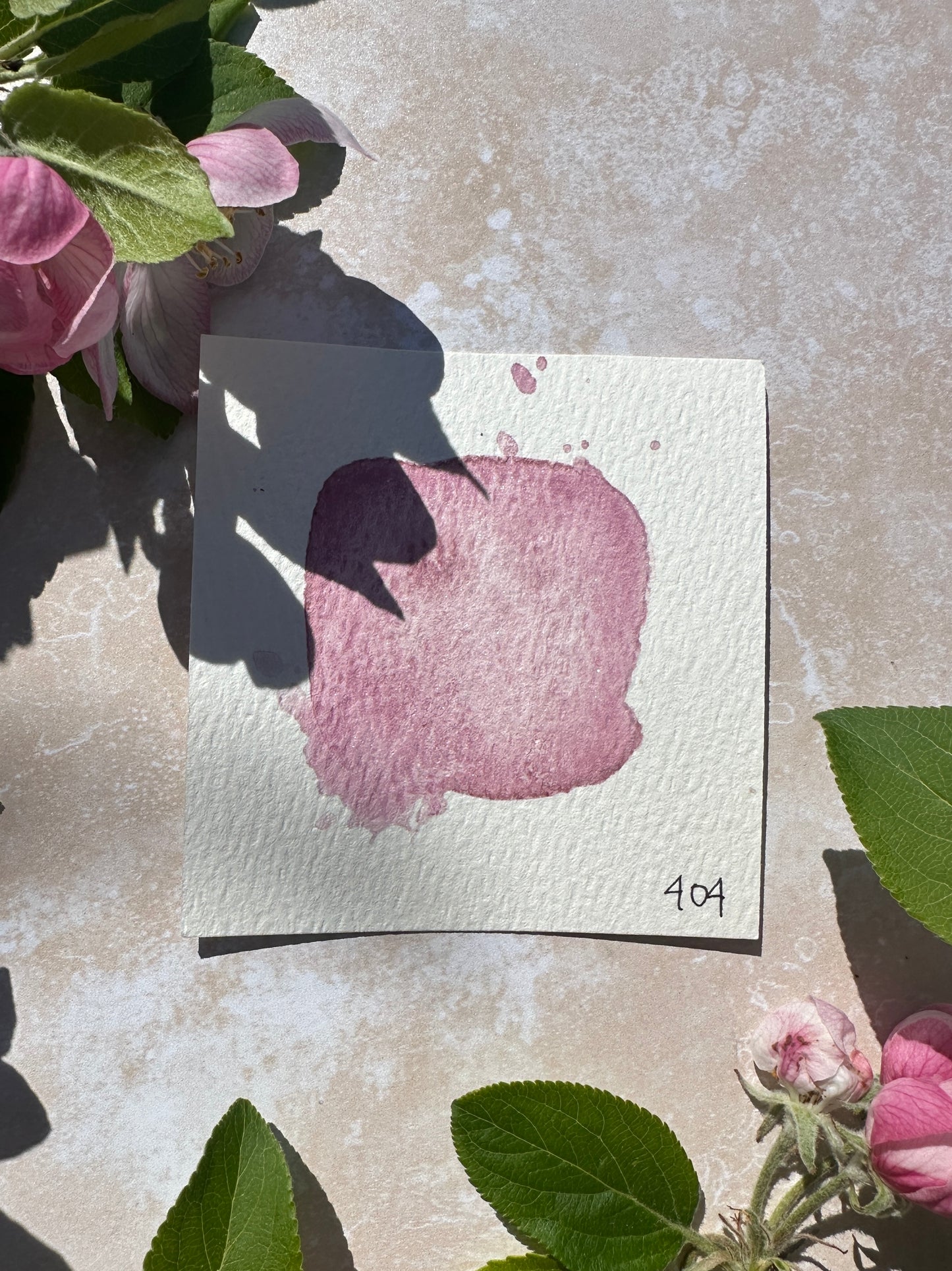
#404 Seashell by Emmeli Eek Christensen of @oak.and.paper
#405 Bowland Heather by Victoria Wilding of @victoriawildingcreates.
#406 Gilded Dusk by Jesse Royston Petersen of @jessepetersenart
#407 Mysteries Revealed by Ali Brown of @alibrownie
#408 Wild Plum by Ingrid Sanchez of @creativeingrid
#409 Grape Jelly by Kristi Nazzaro of @soul_positive
#410 Purple Rain by Tiffany Sharpe of @tiffanysimplysharpe
#411 Evening Quartz by Laura Carter of @illustratorlaura
#412 Irish Rose by Róisín Curé of @roisincure
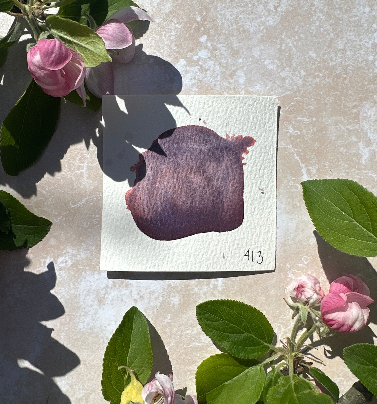
#413 Mountain Fig by Heather Baley of @heather_baley
Thank you so much to all the crazy talented artists - and to everyone who loves purple watercolors. You make this happen!
Much love, Mette